 I have to say I rarely sweat anatomy this much, but these legs were really bothering me, and I was determined to get them right. Or almost right... basically, to the point that I could live with them. I also figured it would be good practice.
So here are the many embarrassing stages of He-Man's legs, for your edutainment. There are aspects I like in each of them, but they usually didn't work harmoniously.
A This is the first sketch I made, which came before He-Man: Part 2.
As you can see, I would have needed to pivot his torso in Photoshop to match properly. These legs reminded me too much of the Hulk, and I opted instead to put him in his boots (as he appeared in the cartoon) rather than barefoot.
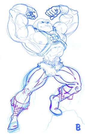
B I was trying to get different angles on his legs to give him a broad, foreshortened stance, but it just ended up looking like he was perched on something, so I drew a rock for his foot.
If you notice on the left leg, I corrected a line there that belonged over his calf and not under.
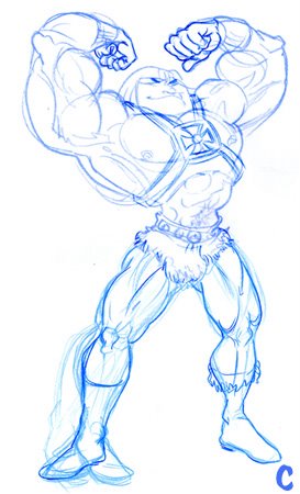
C With this one, he wasn't looking as squat as I wanted. I couldn't figure out which way his right foot should be pointing. Duh. As I once told my friend, fellow illustrator Mike Faille, I sometimes find I have drawn something the complete opposite of what it should be. He had no idea what I was talking about.
On it's own, I like his left leg.
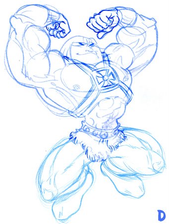
D Now I was quite happy with this one, and was almost prepared to stop. It's a pose befitting his torso, and the entire shape of the character is pleasing. Except, it felt like a cheat... I hadn't truly solved the problem of drawing his legs, so I decided to go at it again.
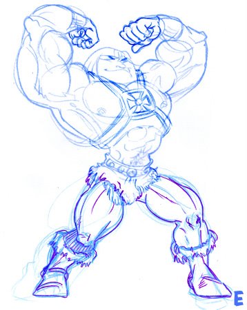
E Voila! The winner. Again, still a few things to fix up, but I'm happy enough with this one to call it quits.

1 comment:
Rem! I like the first version best! Those fat He-Man legs rule! The thin legs are well drawn, but they make him look like the "extreme" modern He-man.
PS: I only found your blog 'cause I was doing a web search for my name. Vain?
Mike
Post a Comment